

Table of Contents
- Retail Store Layout Basics: What Actually Matters
- Retail Store Floor Plan Examples You Can Copy
- How to Improve Customer Flow in Retail Stores
- Retail Store Design Best Practices That Hold Up
- Choosing Fixtures to Match Your Retail Store Layout
- Common Layout Mistakes and How to Avoid Them
- Frequently Asked Questions
Last Updated: September 19, 2026
Retail Store Layout Basics: What Actually Matters
What is the best layout for a retail store? It is the one that matches how customers move and how your stock sells. There is no single universal answer, despite what many guides suggest. The right choice depends on your product range, your floor shape, and the way people shop with you.
At Store Fittings Direct, we have spent over 30 years helping retailers, schools, and warehouses make better use of their space. That experience points to one clear idea: layout is a sales decision, not a design one.
Get it right, and customers find more, buy more, and come back. Get it wrong, and even great stock sits untouched.
Below, we break down the main layout types, show you retail store floor plan examples, and explain how to improve customer flow in retail stores without a costly refit.
Retail Store Floor Plan Examples You Can Copy
Most stores fall into three or four proven layouts, and each one suits a different type of shopping. The trick is matching the pattern to your stock and your customer's mindset.
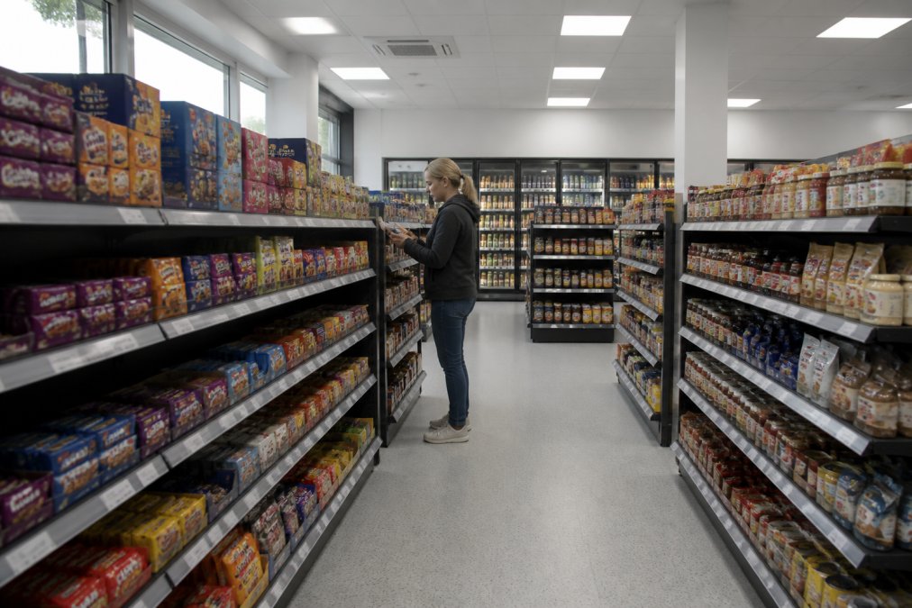
Grid Layout
The grid layout places aisles and shelving in straight, parallel lines. It is the classic supermarket and convenience store format. Customers can see across the store and move quickly.
It works best when shoppers know what they want. Think tinned goods, cleaning products, or stationery.
The downside is that a strict grid can feel clinical. It also pushes customers along set paths, so they may miss products off the main route.
Free-Flow Layout
A free-flow layout uses curved paths, varied fixture heights, and open space. There are no fixed aisles. This suits boutiques, gift shops, and clothing stores.
Free-flow encourages browsing and discovery. Customers wander, and that wandering often leads to extra purchases.
The trade-off is space. Free-flow uses more floor area per product, so it suits smaller ranges shown well rather than large volumes.
Herringbone and Loop Layouts
The herringbone layout sets fixtures at an angle to the main walkway. It is a middle ground between grid and free-flow. Angled aisles slow customers down and expose more products.
The loop layout, sometimes called a racetrack, creates a main circuit around the store. Customers follow the loop and pass every department. IKEA uses a version of this to guide shoppers through the whole range.
Both formats suit larger stores where you want customers to see more of the shop.
| Layout | Best For | Main Benefit | Watch Out For |
|---|---|---|---|
| Grid | Supermarkets, convenience | Speed and clarity | Feels clinical |
| Free-flow | Boutiques, gifts | Browsing and discovery | Uses more space |
| Herringbone | Mid-size stores | Slower browsing | Needs careful angles |
| Loop | Large stores | Full-store exposure | Can feel forced |
How to Improve Customer Flow in Retail Stores
Customer flow is the path people take through your shop, and small changes move it in the right direction. You do not need a full refit to fix a broken route.
Start with the entrance. Give shoppers a clear zone to pause and orient themselves. A bottleneck at the door puts people off before they start.
Next, look at your busiest points. Place popular items toward the back and around the edges. This pulls customers past other products on the way.
A few practical fixes:
- Widen the main walkway so two trolleys can pass
- Keep aisles clear of stock cages and displays
- Use signage to guide people, not to decorate
- Place promotional bays at natural pause points
- Group related products so shoppers do not backtrack
A British Retail Consortium guidance on store environments notes that clear, safe layouts support both sales and customer wellbeing.
Retail Store Design Best Practices That Hold Up
Good retail store design best practices are less about trends and more about basics that keep working. Lighting, sightlines, and clear pricing beat fancy finishes every time.
Light your products, not your ceiling. Bright, even light on shelves makes stock easier to read and buy.
Keep sightlines open. Customers should see across the store from the entrance. Low fixtures at the front, taller ones at the back.
Price clearly and consistently. Confusing labels cost sales. EPOS ticket strips on every shelf edge keep pricing tidy and quick to update.
Keep the checkout area calm and uncluttered. A stressed exit leaves a poor final impression.
Choosing Fixtures to Match Your Retail Store Layout
Fixtures decide whether your layout works in practice. The right shelving makes a grid feel open and a free-flow feel organised.
Gondola shelving is the backbone of most grid layouts. Our Gondola Bay 2.1m with a 470mm base shelf is double-sided, so it creates aisles with display space on both sides. It comes in five widths and connects bay to bay for a seamless run.

For walls, a Wall Shelving Bay 2.4m uses vertical space and keeps the floor clear. It is available in four powder-coated finishes, so it fits most interiors.

Promotional ends matter too. A Shelving End Promo Bay 1.4m sits flush against gondola units and gives seasonal stock its own draw. Add a Plain Gondola End Panel to finish the run and stop products slipping off the end.

A quick way to decide:
- Grid layout: gondola bays plus wall shelving
- Free-flow layout: lower bays and promo ends at varied heights
- Loop layout: gondola runs with clear end caps at each turn
Store Fittings Direct offers a Price Match Promise and trade accounts with 30 days interest-free credit, which helps when you are fitting out a full store.
Common Layout Mistakes and How to Avoid Them
What is the best layout for a retail store? Most layout problems come from a handful of repeat mistakes. Spotting them early saves money and lost sales.
Copying a competitor's layout. Their stock and customers are not yours. A layout that works for a large chain may crush a small shop.
Ignoring the entrance zone. The first two metres set the tone. Clutter here tells shoppers the store is disorganised.
Forgetting the checkout. Long queues and cramped tills push people out. Give the till area room to breathe.
Never reviewing the layout. Tastes and ranges change. A layout that worked two years ago may not fit your stock today.
| Mistake | Fix | Impact |
|---|---|---|
| Copying competitors | Match layout to your stock | Better fit, fewer dead zones |
| Cluttered entrance | Clear the first two metres | Stronger first impression |
| Cramped checkout | Give the till space | Calmer exit, fewer walkouts |
| No review | Reassess each season | Layout stays relevant |
Frequently Asked Questions
What are the four main types of retail store layouts?
The four core types are grid, free-flow, herringbone and loop. Grid suits grocery and convenience retail because parallel aisles make stock easy to find. Free-flow uses curved, informal runs and works well for boutiques. Herringbone angles the aisles diagonally to slow shoppers down. Loop sends customers around a fixed circuit past every department. Most independent shops end up mixing two of these rather than following one strictly.
How does store layout influence customer behaviour?
Layout decides what shoppers see first, how long they linger and how far they walk. A clear decompression zone at the entrance lets people adjust before they start browsing. Aisles wide enough for a compact 60L trolley keep movement smooth. Placing everyday essentials at the back pulls people past higher-margin displays. Get the flow right and customers naturally cover more of the shop without feeling pushed.
What is the decompression zone in retail design?
The decompression zone is the first 1.5 to 3 metres inside the entrance, where shoppers slow down, adjust to the lighting and get their bearings. Most people walk straight through it without noticing anything on the sides, so avoid putting key promotions or premium displays there. Use the space for a clear sightline into the shop instead, then start your selling displays just beyond it.
How can I improve the flow of my shop floor?
Start by measuring your main aisle: it needs to fit your busiest trolley or wheelchair with room to pass. Remove any fixture that narrows a walkway below that width. Keep the route from entrance to till obvious, with no dead ends. Angle a few bays rather than running everything parallel, and use signage to guide people. Small changes to aisle width and fixture placement usually deliver the biggest improvement.
A layout that once worked can quietly stop selling for you, and most owners only notice when takings slip. Store Fittings Direct helps you fix that with durable gondola bays, wall shelving, and promo ends built for daily retail use. With over 1.3 million products sold and fast nationwide delivery, we make it simple to refit a store properly. Get started with Store Fittings Direct and build a layout that moves customers through your space and lifts your sales.


